Make Your Children’s Book Illustration Portfolio Unforgettable
WRITTEN BY ABI CUSHMAN
In 2018, I was sitting in the back of the Grand Ballroom at the Sheraton Hotel in Springfield, Massachusetts. The presenter had announced two runner-ups for the Portfolio Showcase at the New England Society of Children’s Book Writers and Illustrators (NESCBWI) Spring Conference. The two people they called were published illustrators with several books under their belts. Their portfolios were impressive, to say the least.
In the next moment, they called my name as the winner of the Portfolio Showcase. I was confused. I was an unpublished illustrator, and I had been awestruck by everyone else’s portfolios. Then on the screen, I saw my drawing of a skydiving hippo, and realized I really was the winner.

Although I was surprised that day, the truth is, I had worked for two years in a methodical way to build up my portfolio and curate it specifically for children’s book illustration. The work leading up to that New England SCBWI conference paid off. Here’s what I had focused on:
What Art Directors Look for in a Children’s Book Illustration Portfolio
In order to make an unforgettable children’s book illustration portfolio, you have to know what art directors are looking for. That way, your work is focused, and you’re not diluting your portfolio with unrelated pieces. Not only will that weaken the overall impact of your portfolio, it will also be a red flag that you don’t know the industry.
Here are the key elements of an effective children’s book illustration portfolio:
Expressive Kidlike Characters
People are drawn to expressive characters. Often, the way we connect to an illustration is through the shared emotion we have with the characters. We want to feel something. For children’s book illustration, you want to make sure your characters are showing a range of emotions. They shouldn’t all be happy or content. Make some of them annoyed or guilty or embarrassed!
In addition, your characters need to be kidlike. Notice I said kidLIKE and not necessarily kids. If you love drawing kids, that is fantastic. Art directors are definitely looking for expressive kid characters. But if you don’t like drawing kids, this is actually not a dealbreaker. I happen to not like drawing people. My real passion is drawing animals. But I make sure my animals express emotions that kids relate to, and I put them in situations that kids relate to. In this way, my passion for drawing and my unique voice is shining through, but I’m still making art that children will connect with.
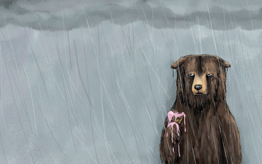
Example: This bear is miserable because his ice cream cone got ruined by the rain.

Art That Tells a Story
Children’s book illustrations need to tell a narrative. They should show a character or characters doing something or feeling something. We should be able to put together at least a part of the story from looking at the image. And a great illustration will have us wanting to know more.
Children’s book portfolios should include sequential art. There should be groups of two to three images that show a sequence of events. In this way, you can show off your visual storytelling skills and also demonstrate that you can draw the character or characters consistently and from different angles.
Example: Here’s a series of images I created featuring a mama and kid raccoon looking at the moon.


Consistency and Technical Ability
You do not need to go to art school in order to have a great portfolio. But you do need to demonstrate proficiency in art and design skills like color, line work, light and shadow, and perspective. It can be difficult to assess your own work for these skills, so getting a critique by an art director or from other illustrators is really helpful. If you are consistently told something isn’t working, then it’s worth studying the work of other illustrators who do that skill well and practicing.
Many times what makes a great portfolio piece is great design. For starters, picture book illustrations need to leave space for the text. They need to keep the gutter (where the pages meet in the middle) clear of faces and other important details. But also think about using design to enhance your story–white space, scale, and angle, for example, can all be used to amp up the emotion of the story or build anticipation.
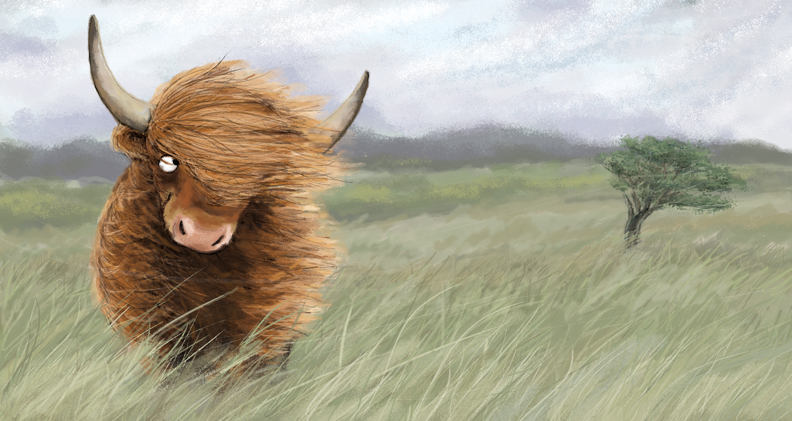
Example: Here I placed the character to the left side of the image looking to the right. The viewer’s eye follows the highland coo’s gaze to the right, in the same direction as the wind blowing through its hair and the scenery.

Organization
Organize your portfolio in a smart way. It is distracting when there is no thread that connects your pieces together. Your sequential pieces should be together and in the correct order. If you have more than one style, you should divide your portfolio up by style. But make sure you have several pieces demonstrating a high proficiency in each style. If you only have one piece exemplifying that style, take it out.
Think of your portfolio like a book. Be creative in how you might organize your pieces to create a memorable experience as the art director flips through the pages (or clicks through the images online). And then go out with a bang. Ideally, you want to start with your second strongest piece and end with your strongest.
Your Voice
And finally, the most important part of a standout portfolio is your unique voice. It can be tempting to try to emulate another illustrator you admire, but art directors want to see what YOU bring to the table. So draw what you’re passionate about. Don’t try to draw what you think other people like. Draw what YOU like, and your unique voice will shine through.
So take a look at your portfolio, see what’s missing, and dive in!

More Illustration Tips
- How to Send Illustrator Promo Postcards to Art Directors
- How to Illustrate a Children’s Book: Getting Started
Share this Article:
